As a product designer, I used a lean, user-centered approach to validate Maxima’s features early, build a scalable design system, and streamline workflows. This method enabled efficient updates, enhanced user engagement, and supported Maxima's expansion with a cohesive, adaptable user experience.
Role
Product Designer
Timeline
3 mo (Jul - Sept’24)
Core Responsibilities
Design System, Product design, Prototyping
Intro
Maxima is an AI-driven accounting platform aimed at transforming enterprise accounting by cutting costs, reducing errors, and delivering real-time insights. Working alongside two startup founders and a team of developers, we focused on a scalable, user-centered design to streamline automation while keeping user complexity low. Our approach prioritized lean validation, rapid prototyping, and preparing the platform for future growth.
The problem
Maxima's main challenge was to validate its concept efficiently while preparing for scalability. As the platform grew, inconsistencies surfaced, highlighting the need for a cohesive design system. With an increasing number of screens and a push for bold branding, Maxima required a design framework that could support both immediate validation and long-term scalability.
Solution
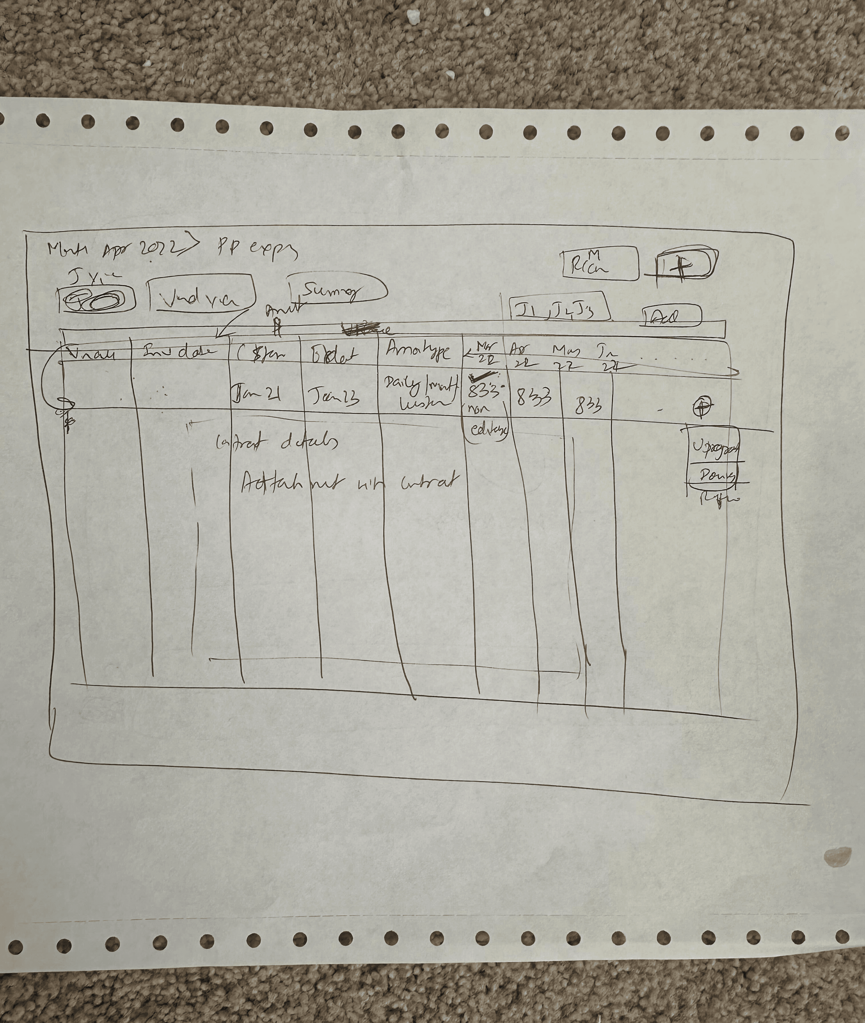
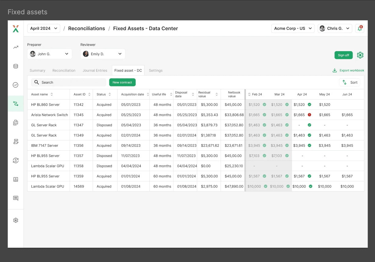
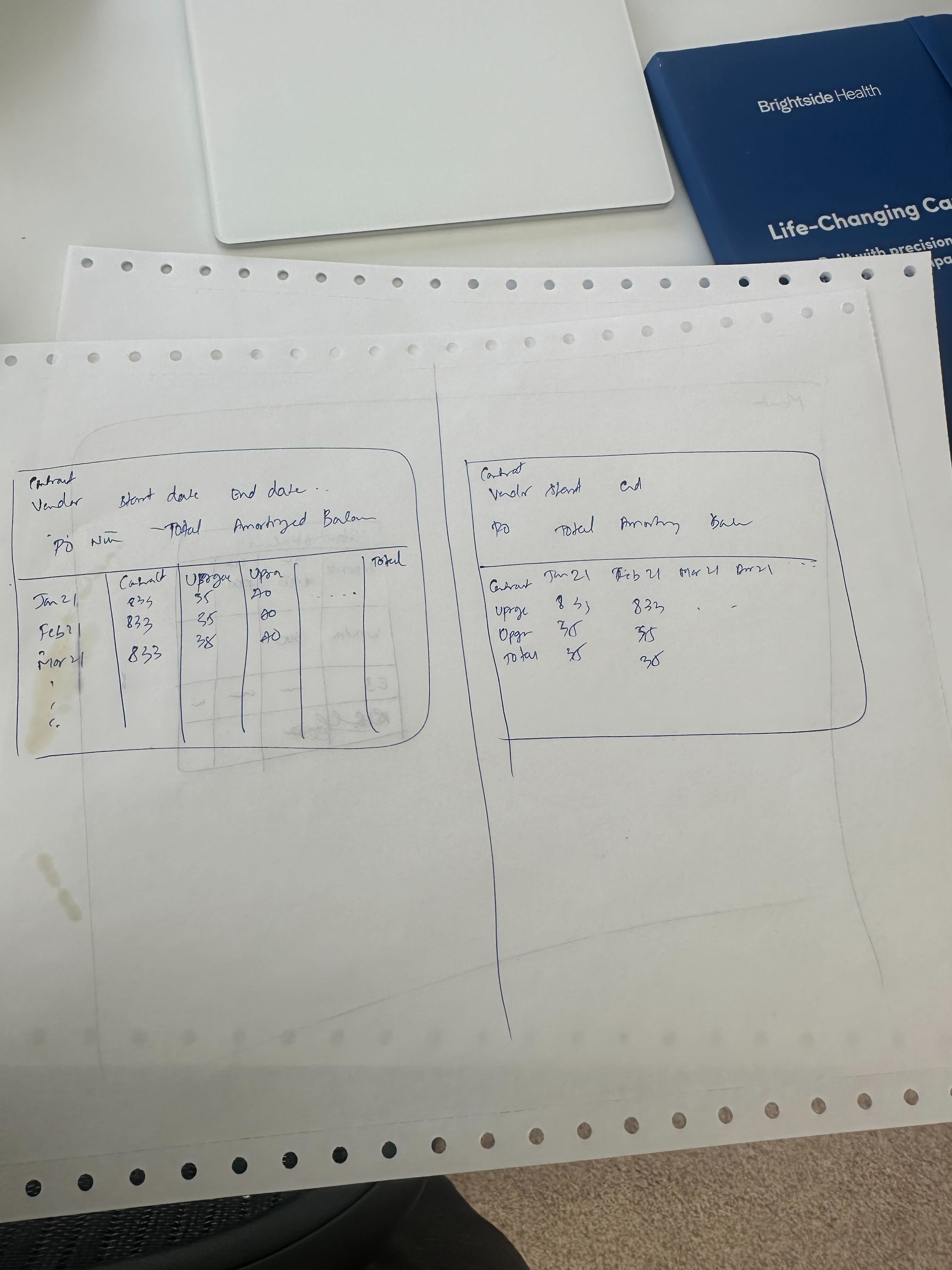
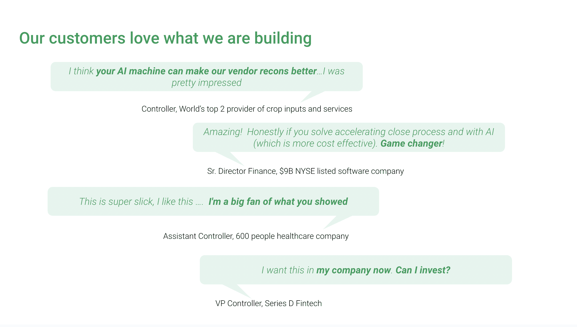
Initial designs were created through collaborative 1:1 sessions with stakeholders. Stakeholder sketches were transformed into prototypes that were tested by potential users and investors, gathering critical feedback. At this stage, we focused on quick iterations without implementing a full design system, keeping the process agile and cost-effective.
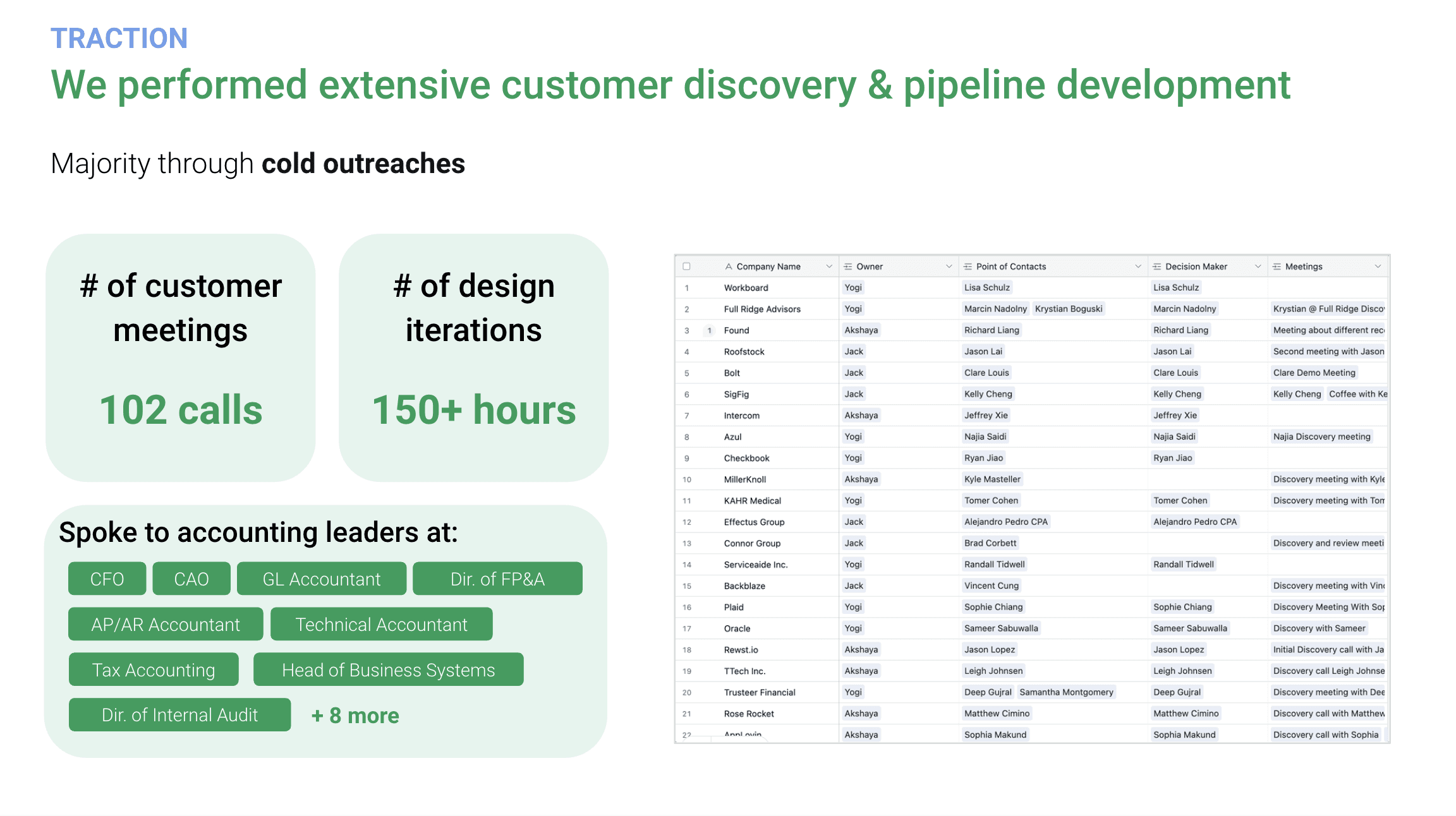
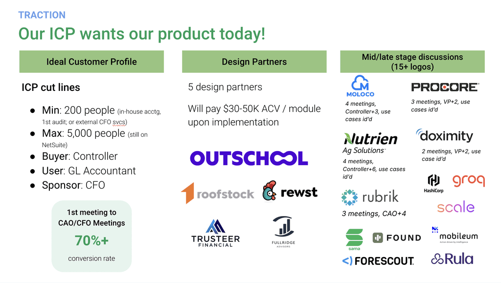
This led to raising customer & investors enthusiasm about the tools potential and opened up new issues and potential features.
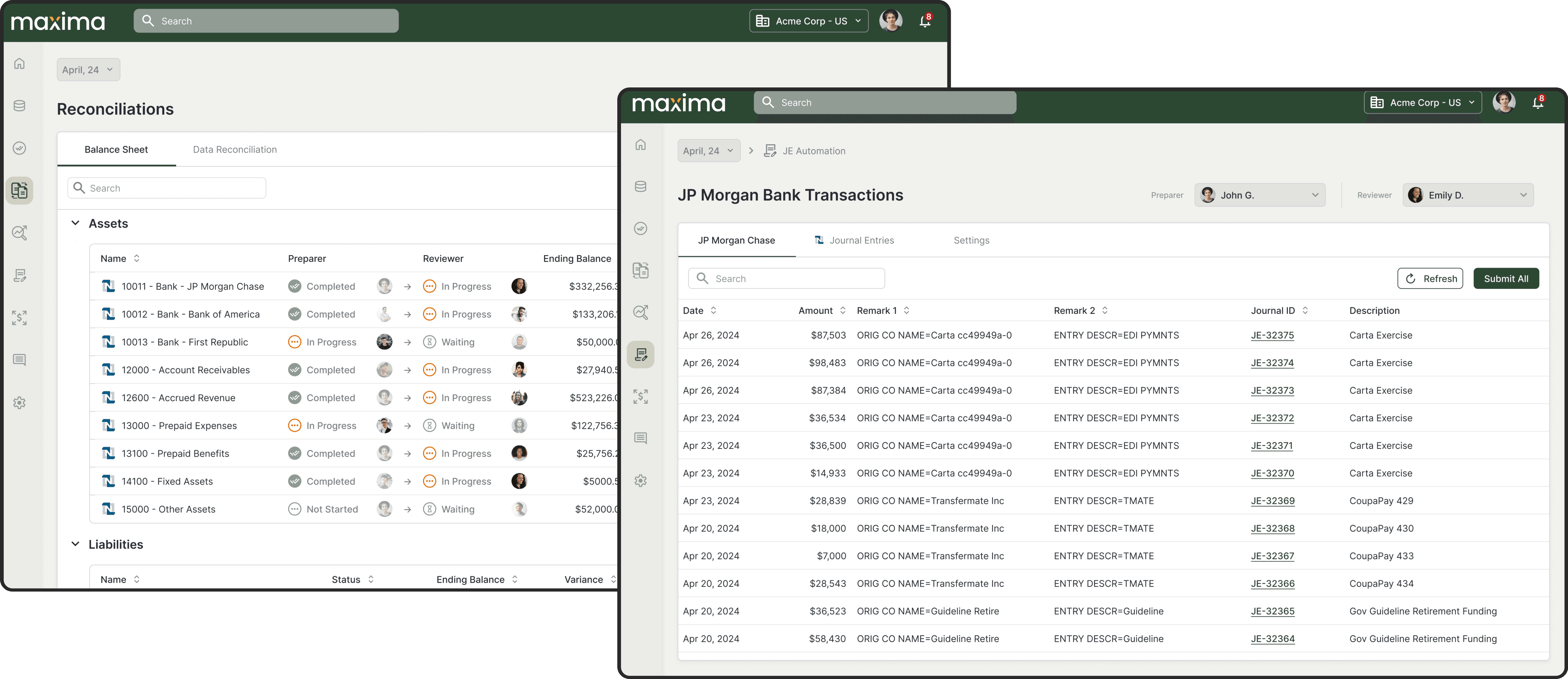
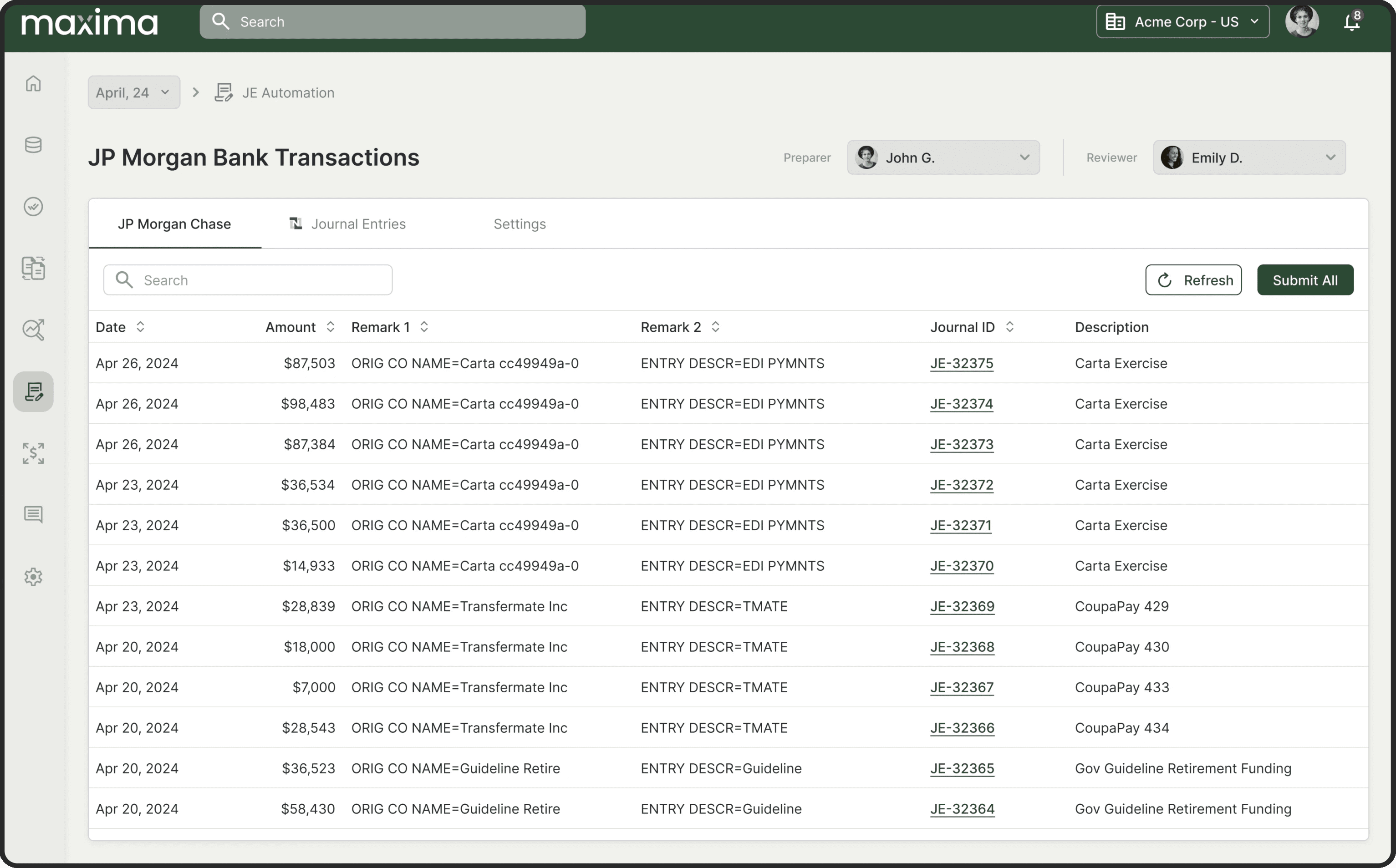
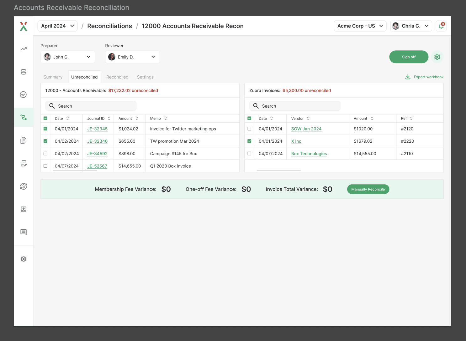
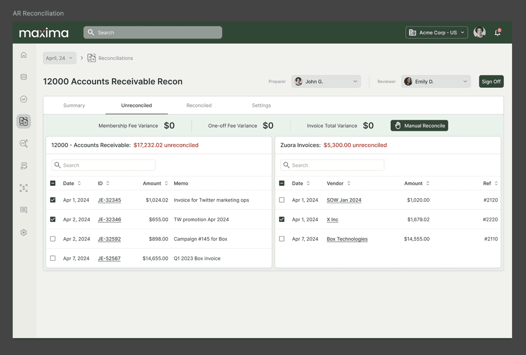
Responding to Maxima’s push for bold new branding, we undertook a redesign to ensure the platform resonated with its target audience. High-level prototype updates consolidated screens, reduced user friction, and allowed stakeholders to make adjustments, facilitating an efficient and scalable design process.
Component Placement for Stakeholder Navigation: Tables were organized and placed within corresponding screens to support easy navigation for stakeholders, allowing them to explore design elements specific to each page.
Hierarchy and Visual Balance: Buttons were designed with a slightly rounded shape to reflect professionalism, while backgrounds and secondary elements were set in grayish-green to make primary content stand out.
Adjusting Navigation Hierarchy: The breadcrumb navigation was deliberately placed lower in the visual hierarchy to prioritize primary actions and maintain focus on critical elements.
Before
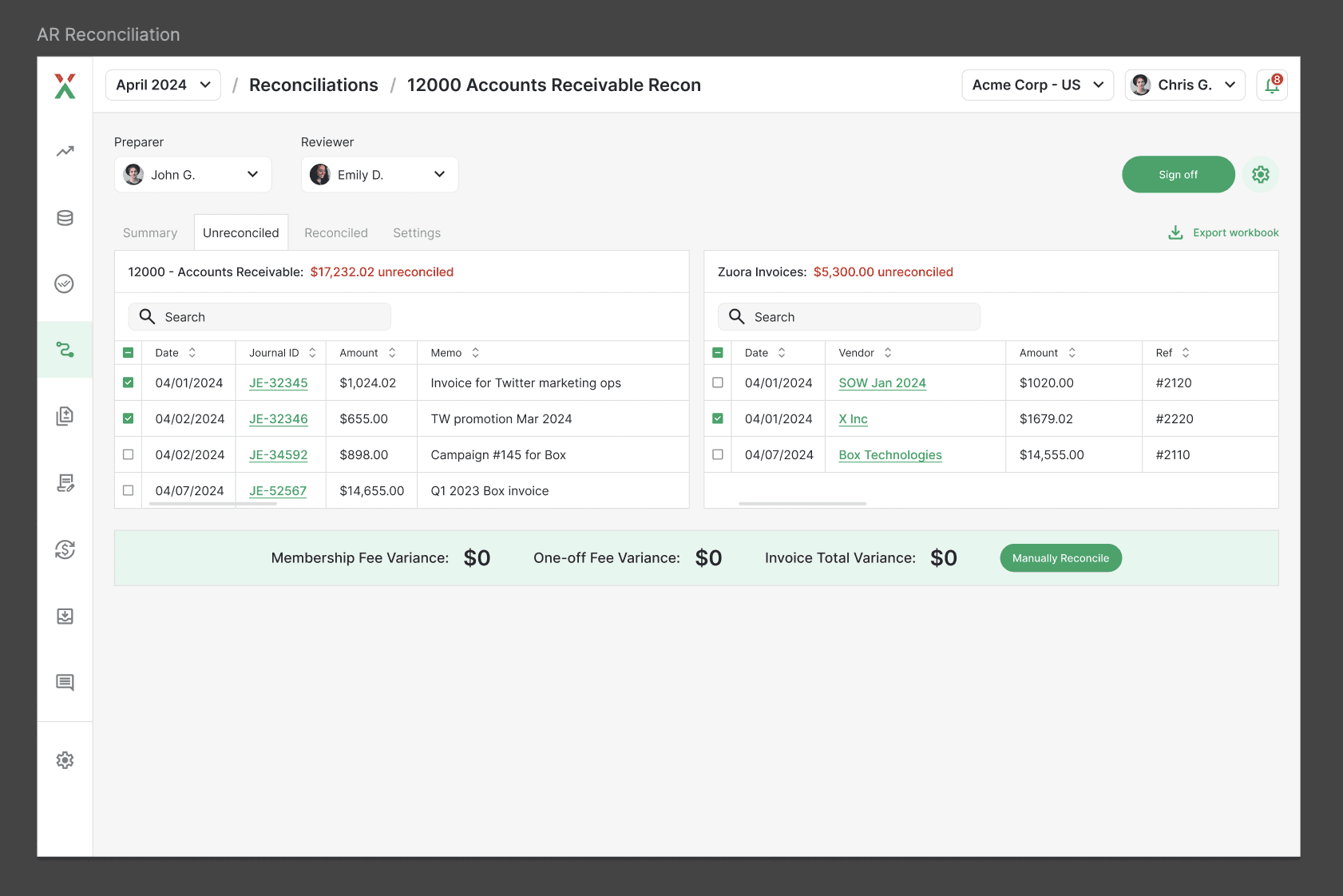
After
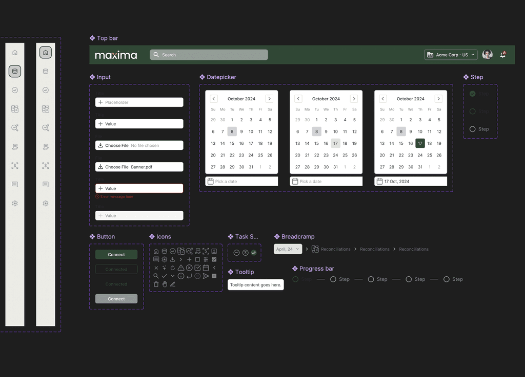
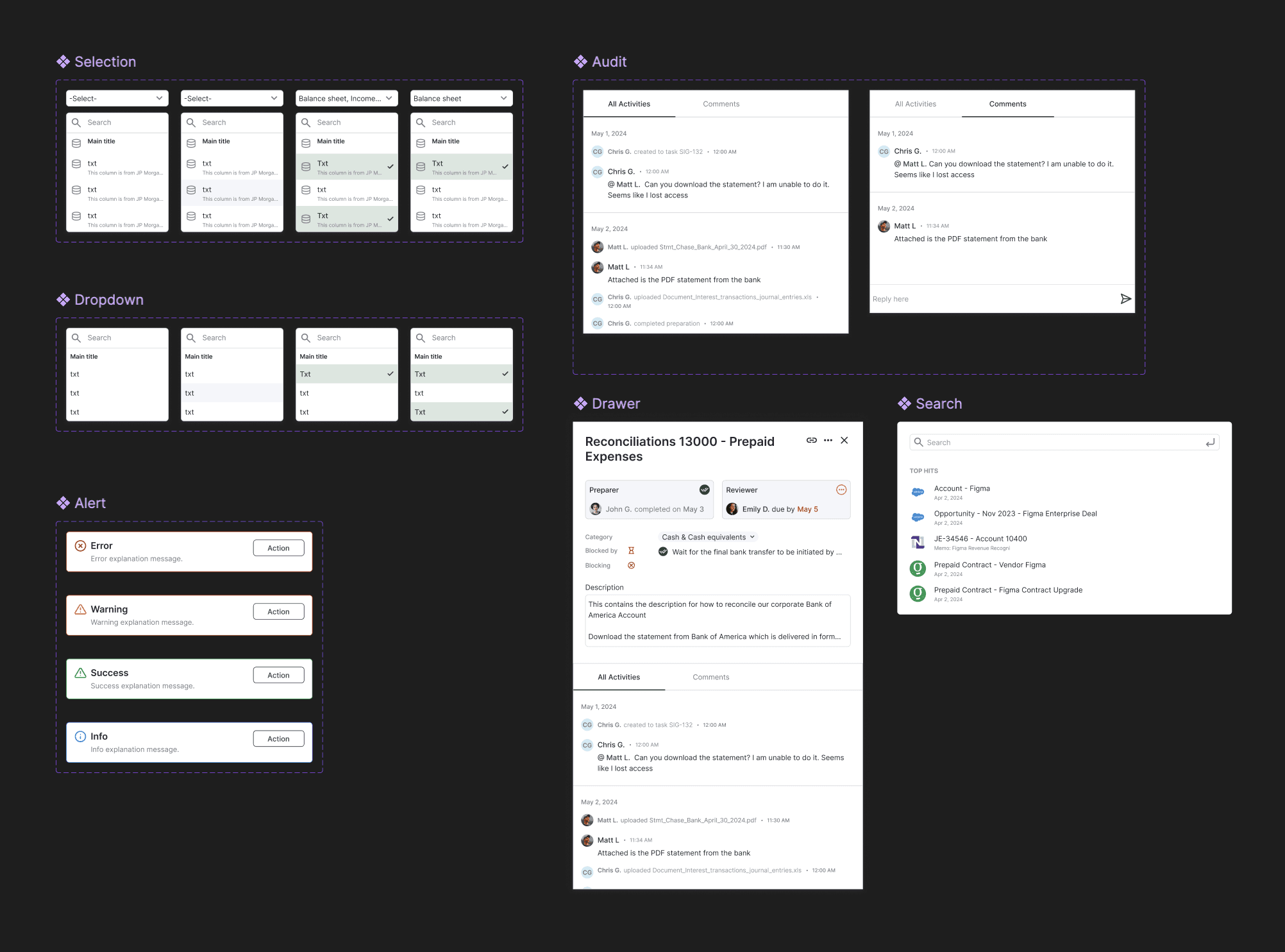
As the platform gained traction and screen numbers grew, the need for consistency and ease of scaling became essential. I recommended and established a robust design system that included reusable components and standardized UI elements, enabling the platform to evolve smoothly as new features were added.
Note: It was still important to make it as easy for non-designer as possible, because the stakeholders would also continue editing tool during & after customer feedback by themselves.
Global Elements Componentization: Key elements like navigation, sidebar, breadcrumbs, drawers, and alerts were turned into reusable components, making the design consistent and easy to maintain.
Uniform Inputs and Buttons: Inputs, buttons, icons, and status states were defined as components, ensuring consistency in style and behavior across all pages.
Table Variants: Different table formats and variations were created as components, enabling quick updates and streamlined prototyping without needing manual changes across each screen.
Key Outcomer
Through this lean, user-centered approach, we:
Validated Core Features with minimal resources, helping secure investor buy-in.
Increased Design Consistency with a structured design system, ensuring seamless scaling.
Enhanced User Engagement by simplifying workflows and improving the user experience.
Conclusion
The Maxima case demonstrates the value of a lean design strategy in creating a scalable, impactful product. By focusing on efficient validation and adaptable design, we laid the foundation for Maxima’s growth in accounting automation. This approach allowed Maxima to balance immediate user needs with long-term scalability, establishing a product that is both user-friendly and ready for expansion.
Kudos
Kudos to the great team and to founders Jack and Akshaya to make this project come true. And special thanks to Jack's cats that made our meeting more fun!
